Thank you for visiting the site. This article is about the “slip chart line”, a progress-tracking technique for project schedules.
When you open the schedule in a status meeting, can you answer “so where exactly are we behind?” straight away? Each task may have a percentage next to it, and yet which part of the project is actually in danger is surprisingly hard to read off. The slip chart line is an old and very good technique for answering that question with a single zig-zag line.
Below I cover how to read one, how to draw one, how to do it in Excel and where that runs out, and finally a free tool that draws it for you.
What a Slip Chart Line Is
A slip chart line is a polyline drawn on top of a Gantt chart showing “how far each task has actually got as of the status date”. In Japanese it is called an inazuma-sen, a “lightning line”, because it zig-zags across the chart like a bolt. You do not see it much in English-language tools, but it has been widely used in Japanese construction, manufacturing and software projects for decades.
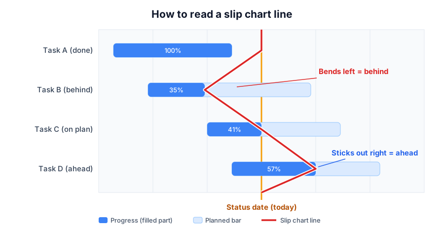
The rule is simple. Starting from the vertical line at the status date — today, or the reporting cut-off — the line bends on each task’s row to pass through “the position corresponding to its percentage complete”.
Reading It: Left Is Behind, Right Is Ahead
Boiled down, reading a slip chart line is just this.
- A task where the line bends left of the status date is behind. Work that should have been finished by today is still outstanding
- A task where the line sticks out right of the status date is ahead, further along than planned
- A task where the line runs straight down the status date is on plan
The wider the “swing”, the bigger the gap against the plan. It really earns its keep in status meetings: a delayed task carves a big notch to the left, so without anyone reading the document, the whole room can see where the discussion needs to go.
The other thing I value about it is that “it is drawn the same way every time”. Verbal progress reports are full of subjective padding — “nearly done” and so on — but the slip chart line is determined mechanically from percentages and dates, so there is no room to fudge it.
How to Draw One
Drawing it by hand goes like this.
- Pick the status date and draw a vertical line on the schedule (today, or the reporting cut-off)
- For each task, mark the “reached point”, that is, the percentage converted into a position along the bar. A 10-day task at 40% is marked at day four
- Working down from the top row, connect the status-date line to each task’s reached point
- Completed rows and not-yet-started rows pass straight through the status line
The calculation people get stuck on is “calendar days or working days?”. Compute a task spanning a weekend in calendar days and it will look more behind than it is, so working days is the default. Doing that conversion by hand every week is, frankly, quite a lot of work.
The other caveat is that a slip chart line is only as good as “how honest the percentages are”. Feed it a generous 90% — the kind that stays at 90% for a month — and the line will be beautiful and meaningless. Agreeing as a team on how percentage complete is defined (counted against deliverables, for instance) changes how much the line is worth.
Drawing It in Excel, and Where That Stops Working
There are broadly two ways to put a slip chart line on an Excel schedule.
| Method | How | Weakness |
|---|---|---|
| Draw a shape | Hand-draw the polyline with a freeform shape | Redraw it every time progress changes. Past lines are not kept |
| Draw a chart | Compute coordinates with a scatter plot plus error bars | The formulas get complicated, and few people can maintain it |
Both work, in the sense that you get a line. But the value of a slip chart line lies in “drawing it to the same rule every week, every day”, and if one drawing takes half an hour, it gradually stops getting updated. The moment it stops being updated, it stops doing anything.
The other limit is that past lines are not preserved. Comparing last week’s line to this week’s is what tells you the “trend” — whether the delay is widening or you are clawing it back. Doing that in Excel means copying and saving the sheet every week, which is another practice that does not survive contact with a busy project.
What to Do Once You Can See the Delay
A slip chart line is a tool for “finding” delays, so it is used together with what you do next. The standard three moves are these.
- Check the impact on downstream tasks. In particular, a delay on the critical path is a delay to the delivery date
- Build a recovery plan: who does the remaining work, when, and whether you bring in help
- Count the “float” to the deadline — how many working days of slack are left — and if it is heading negative, tell the stakeholders early
Those judgements involve dependencies and working-day arithmetic, which is where doing it by hand in Excel gets hard again. Slip chart line, dependencies and float are really information you want managed as one set.
A Free Tool That Draws It Automatically
So I built one. INAZMA is named after the technique, and it is a free, no-sign-up scheduling tool built around the slip chart line.
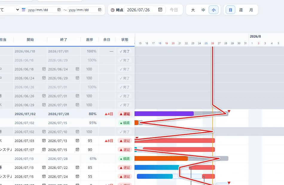
Around the slip chart line, it does the following.
- Enter percentages on the WBS and it draws the working-day-based slip chart line automatically (weekends, Japanese public holidays, and your own non-working days)
- Progress is snapshotted automatically every day, so you can replay past lines with a slider or a play button
- Last week’s line can be overlaid as a “comparison line”, which shows the trend on the spot
- Export the Gantt plus slip chart line as a PNG and paste it straight into your status report
Data is stored only inside your browser and never sent anywhere. Moving over from an Excel schedule is a copy-and-paste of a cell range, so the quickest thing is to see how the line bends on your current schedule.
The limits of Excel schedules themselves are covered in detail in this article.

Summary
This article covered the slip chart line.
With one simple rule — bends left means behind, sticks out right means ahead — it shares the dangerous parts of a schedule in a single glance. Its value is therefore in continuity, and since drawing it by hand forever is hard work, I think the realistic move is to set up something that keeps drawing it for you.
Once progress is visible, the next thing worth seeing is how loaded people are. How to build a resource load chart is covered here.
I hope you will read the next article as well.
Also popular with readers
📚 Series: Project Management in Practice (Beyond Excel, Slip Charts, Load Charts) (2/3)