Thank you for visiting the site. This article is about the “resource load chart”, the basic technique for resource management.
A plan that looked perfectly tidy on the schedule turns out, once work starts, to have one particular person working late every night. It is a common sight on projects, and the cause is usually back in the planning stage. The dates were decided, but nobody counted how many person-days were stacked on that person in that week.
The resource load chart is the tool for dragging that “invisible overload” into the open while you are still planning. Below I cover how to build one and read it, what to do once you find an overload, and how far Excel gets you.
What a Resource Load Chart Is
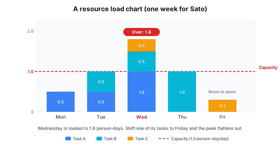
A resource load chart stacks “who is carrying how much work, and when” into a matrix of owner against time. Work is generally counted in “person-days” — one person working one day is 1.0 person-days. Stack the bars by date and the result looks like a range of hills, which is where the Japanese name yamazumi, “piled mountains”, comes from.
The point is not the total workload but how unevenly it sits along the date axis. The same total will break the team if it is bunched into the week before the deadline, and will be fine if it is spread flat.
How to Build One
You can build a load chart from nothing more than the schedule — a list of tasks with their durations.
- For each task, confirm the owner and the period
- Decide each task’s “load per day”. Full-time is 1.0 person-days/day; half your attention is 0.5
- In an owner-by-date grid, write the sum of the loads of every task overlapping that day
- Draw each person’s “capacity” line (normally 1.0 person-days/day for one person)
- Mark every day where the sum exceeds capacity
Days marked at step 5 are overloaded — physically impossible amounts of work. The opposite case, a stretch sitting well below capacity, is “slack”, and that also matters if you are paying an external partner for a fixed headcount.
Two things to watch when calculating. Count in working days, excluding weekends and holidays. And for someone who cannot spend a full day on delivery work because of meetings and support, discount the capacity side to something like 0.8 person-days.
Once You Find an Overload: Levelling
The adjustment you make after finding an overload is called “levelling” (resource levelling). There are fundamentally only four moves.
| Move | What it means | Suits |
|---|---|---|
| Shift | Move the task earlier or later to flatten the peak | Deadline has slack, dependencies are loose |
| Split | Divide the task and hand part of it to someone else | Work with a low hand-off cost |
| Add | Bring in another person or ask for help | Neither the dates nor the tasks can move |
| Cut | Reduce scope or defer | Low-priority work is mixed in |
The convention is to start with the cheapest option, shifting. Adding people temporarily makes things slower because of onboarding and hand-over (Brooks’s law), so it is safer treated as a last resort.
What matters here is not over-automating the levelling. Some tools will level automatically, but when dates get moved mechanically you end up with plan changes nobody can explain. Find the overload with the chart, and let a human decide how to level it. In practice I find that division of labour works best.
Building One in Excel, and Where That Stops
In Excel, the two usual approaches are these.
- Keep a separate owner-by-date grid alongside the task list, and sum the load of overlapping tasks with
SUMIFSorSUMPRODUCT - Expand each task into one row per day, then aggregate owner by date with a pivot table
Either works once built, but in practice the painful part is that you now have the schedule and the load chart to keep in sync. Every date change means recalculating and rechecking the load side, and owner changes and holiday handling make the formulas steadily worse. The more routine schedule changes are, the further the load chart drifts from reality.
Which is to say a load chart really ought to be “something derived automatically from the same data as the schedule”.
A Free Tool That Builds It Automatically
INAZMA, the free scheduling tool I develop, builds the load chart on exactly that principle. Put owners and dates into the schedule (WBS plus Gantt chart) and the load tab stacks an owner-by-working-day load matrix automatically.
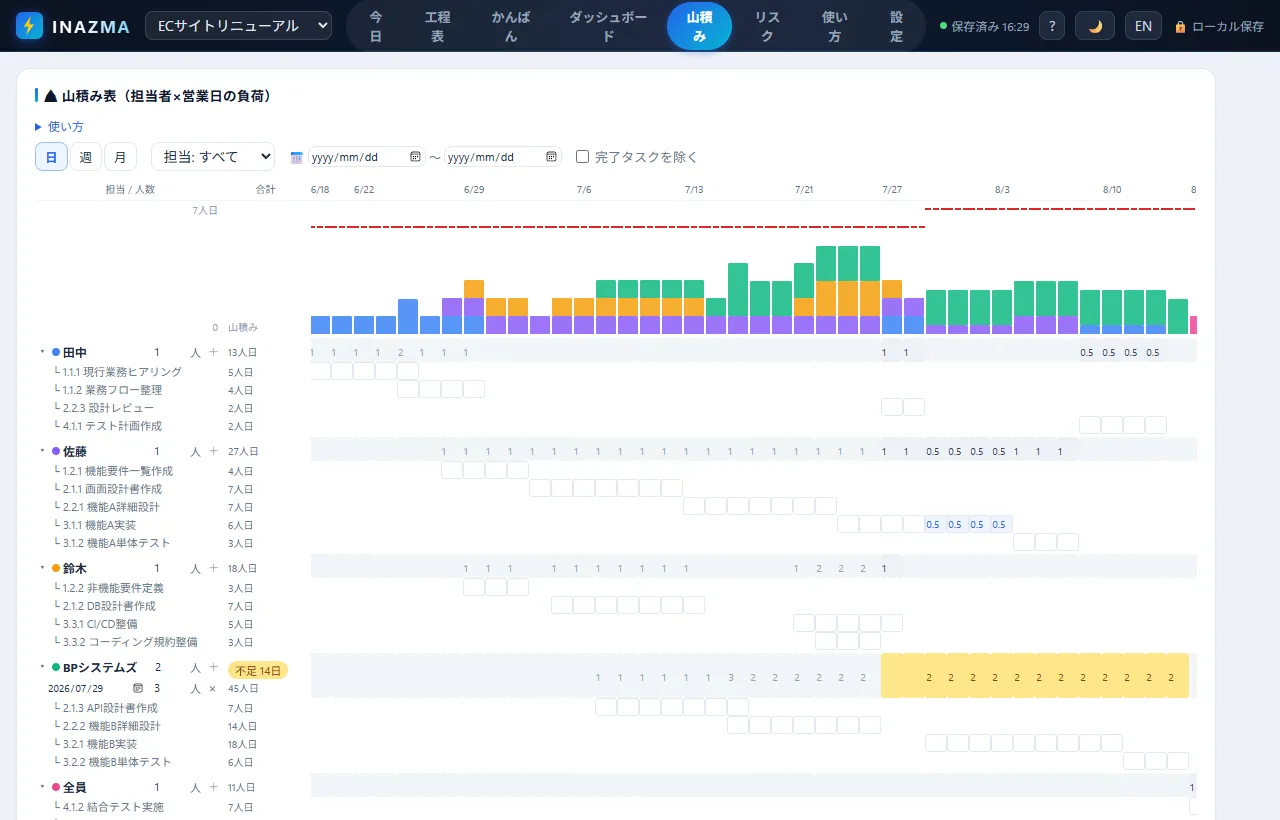
The details you actually need in practice are covered too.
- Switch between day, week and month views. The month view lets you enter in “how many person-months on which project” terms
- Capacity is judged as headcount times one person-day. Fractions such as a 0.5 person on split duties, or an effective 0.8 once meetings are removed, are supported
- If you are contracting a supplier by headcount, set the number and it flags slack as well as overload. Mid-project ramp-ups and departures apply from a given date
- You can type a value like “0.5 person-days/day this week” straight into a cell, and load for the same person is summed across multiple projects
Once an overload is visible, you adjust from the schedule side — shifting the selected tasks by working days in bulk, or using the one-click reschedule that follows the dependencies. Automatic levelling is deliberately absent. Data is stored only inside your browser, so a staffing list that cannot leave the building is safe to work with.
⚡ Build a load chart in INAZMA (free)No sign-up, runs in the browser. Your data stays on your device
On a related note, this article looks at the schedule itself.

Summary
This article covered the resource load chart.
The essence of it is simply this: stack person-days on an owner-by-date grid and compare against a capacity line. Keeping that updated by hand through every schedule change is hard work, though, so the trick to making it last is having it fall out of the same data as the schedule.
When overloading is only noticed after it happens, the only move left is “work harder”. Look at the hills while you are still planning, and flatten them while there is room. It is unglamorous, but I think it is the single most effective thing you can do in running a project.
The progress side of the picture is covered in the slip chart line article.

I hope you will read the next article as well.
Also popular with readers
📚 Series: Project Management in Practice (Beyond Excel, Slip Charts, Load Charts) (3/3)