Thank you for visiting this site. This article is the fifth installment in the series on code-manageable diagrams for the AI era, covering 3 niche hardware and syntax tools. For the full series index, see the Complete Guide.
This article covers quite niche content. Digital circuit timing diagrams, programming language syntax diagrams, network packet structure diagrams — if these mean nothing to you, feel free to skip ahead to the next article.
Conversely, if you work with hardware design or protocol specifications, this will likely be an eye-opener: “these diagrams can be code-managed?” These niche diagram types have traditionally been drawn by hand or in Excel. Define them in code and you can let AI generate and update them — freeing you from the tedious work of redrawing diagrams every time a specification changes.
Comparison Table
| Name | Syntax | AI Compatibility | Diagram Types | Highlights |
|---|---|---|---|---|
| WaveDrom | JSON | ○ | Digital signal waveform diagrams (timing charts) | For hardware design and protocol specifications |
| Railroad Diagram | JavaScript / Python | ○ | Programming language syntax diagrams (railway-style diagrams) | For explaining language specs and API argument patterns |
| Bytefield | Custom | △ | Communication packet byte structure diagrams | For network protocol specifications |
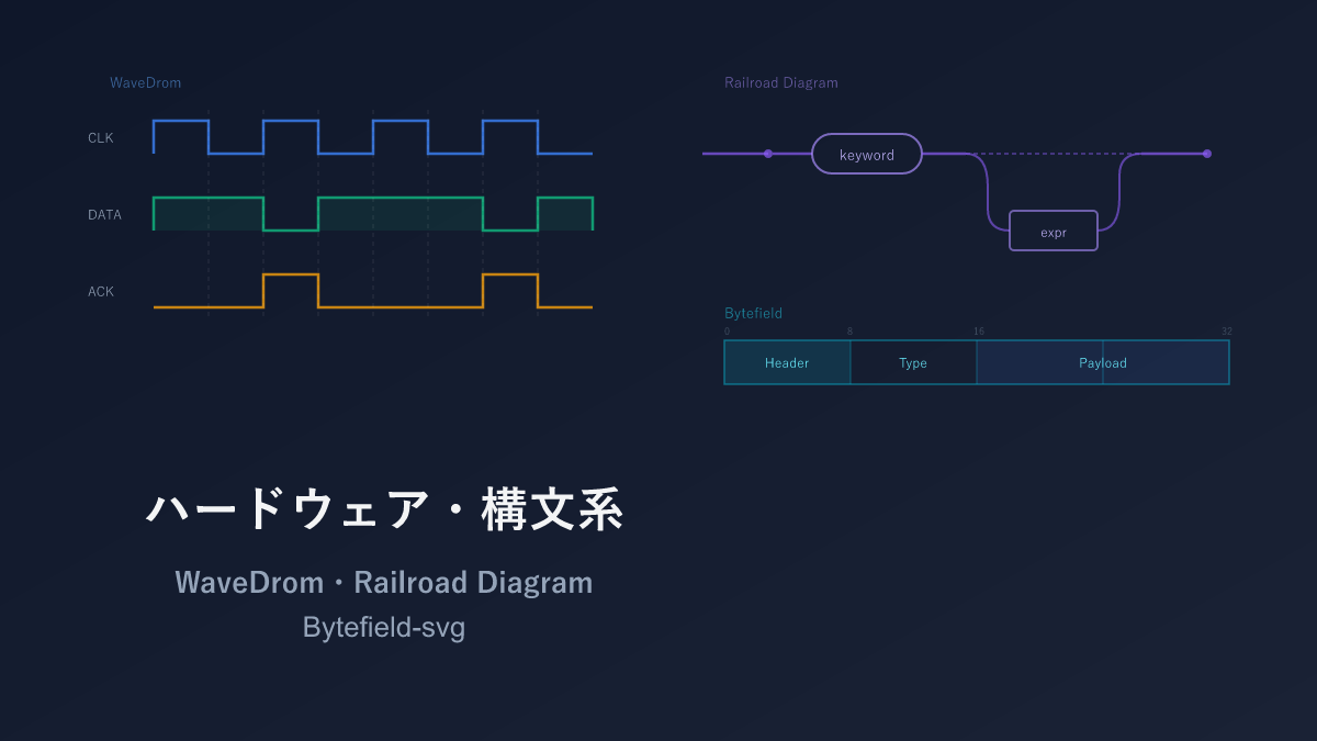
WaveDrom — Timing Diagrams for Digital Circuits
WaveDrom is a dedicated tool for drawing digital circuit timing diagrams (waveform charts) using JSON notation. These diagrams represent the time-series behavior of clock signals and data buses, and are indispensable in hardware design and communication protocol specifications.
A browser-based editor is available, allowing you to edit while viewing real-time waveform previews.
Sample: Clock Signal and Data Transfer

{ "signal": [
  { "name": "clk",  "wave": "p........" },
  { "name": "data", "wave": "x.345x...", "data": ["A", "B", "C"] },
  { "name": "req",  "wave": "0.1..0..." },
  { "name": "ack",  "wave": "0..1..0.." }
]}
Each character in the wave field represents one clock cycle. p is a positive-edge clock, 0/1 are Low/High, x is unknown, and . continues the previous value.
Sample: SPI Communication Protocol

{ "signal": [
  { "name": "SCK",  "wave": "0.p......p...." },
  { "name": "MOSI", "wave": "x.=.=.=.=.x...", "data": ["MSB", "", "", "LSB"] },
  { "name": "MISO", "wave": "x.=.=.=.=.x...", "data": ["MSB", "", "", "LSB"] },
  { "name": "SS",   "wave": "10........1..." }
],
  "config": { "hscale": 2 }
}
Sample: Register Map
WaveDrom also has a register (bit-field) rendering feature.

{ "reg": [
  { "bits": 8,  "name": "data",   "attr": "RW" },
  { "bits": 4,  "name": "addr",   "attr": "RW" },
  { "bits": 1,  "name": "wr" },
  { "bits": 1,  "name": "rd" },
  { "bits": 1,  "name": "en" },
  { "bits": 1,  "name": "rsv",    "type": 1 }
],
  "config": { "bits": 16, "lanes": 1 }
}
Pros and Cons
For anyone not involved in digital circuits or protocol design, this tool will rarely have a use case. The single-character wave field notation (p, 0, 1, x, .) is unique and takes some time to get used to.
That said, WaveDrom is the standard tool for timing diagrams. JSON notation makes it easy to manage as structured data, and register map rendering is built in. For hardware engineers or those writing protocol specifications, this is a tool worth knowing.
AI Compatibility
JSON format is easy for AI to generate, but the single-character wave field notation (p, 0, 1, x, .) is unique and AI sometimes gets timing lengths wrong. On the other hand, well-defined standard protocols like SPI, I2C, and UART have clear specifications, so “draw an I2C timing diagram in WaveDrom” can produce highly accurate output. For custom protocol timing diagrams, manual adjustment is the expectation.
Railroad Diagram — Syntax and Grammar Railway Diagrams
A Railroad Diagram is a diagram that visually represents the grammar of programming languages and data format syntax. The name comes from its resemblance to a railway line map. You may have encountered these in SQL syntax references or JSON specifications.
Following along the diagram from left to right — as if a “train is traveling” — conveys valid syntax patterns. Branches represent choices, loops represent repetition, and bypasses represent optional elements.
Sample: SELECT Statement Syntax
import { Diagram, Sequence, Choice, Optional, OneOrMore,
         Terminal, NonTerminal } from 'railroad-diagrams';

const selectStatement = Diagram(
  Terminal('SELECT'),
  Choice(0,
    Terminal('*'),
    OneOrMore(NonTerminal('column'), Terminal(','))
  ),
  Terminal('FROM'),
  NonTerminal('table'),
  Optional(
    Sequence(
      Terminal('WHERE'),
      NonTerminal('condition')
    )
  ),
  Optional(
    Sequence(
      Terminal('ORDER BY'),
      NonTerminal('column'),
      Choice(0, Terminal('ASC'), Terminal('DESC'))
    )
  )
);
Choice represents alternatives, Optional represents optional elements, and OneOrMore represents repetition.
Sample: JSON Value Syntax
const jsonValue = Diagram(
  Choice(0,
    NonTerminal('string'),
    NonTerminal('number'),
    NonTerminal('object'),
    NonTerminal('array'),
    Terminal('true'),
    Terminal('false'),
    Terminal('null')
  )
);
Pros and Cons
Many people have seen railway diagrams in SQL or JSON syntax references, and this library is what generates them from code. There is no question that following the diagram visually is far faster than reading BNF or EBNF text descriptions. SQLite, PostgreSQL, and the official JSON Schema documentation have all adopted them.
It is a fully specialized tool — usable only for syntax and grammar representation — and the library choice is essentially limited to the railroad-diagrams JavaScript/Python version. When grammar is too complex, diagrams become very wide and hard to read, so breaking them up is a useful strategy.
AI Compatibility
LLMs have extensive knowledge of programming language grammar and BNF, so prompts like “draw the syntax diagram for a SQL SELECT statement using the railroad-diagrams library” produce structural code using Terminal, NonTerminal, Choice, and Optional. Grammar accuracy is one of LLMs’ strengths, so missing elements are rare.
Bytefield-svg — Byte Field Diagrams
Bytefield-svg is a tool for diagramming the field structure of network protocols and binary formats as SVG. It generates from code the field diagrams — divided by bit and byte boundaries — that you commonly see in RFC documents.
Sample: TCP Header

(def boxes-per-row 32)
(def box-width 20)

(draw-column-headers)
(draw-box "Source Port" {:span 16})
(draw-box "Destination Port" {:span 16})
(draw-box "Sequence Number" {:span 32})
(draw-box "Acknowledgment Number" {:span 32})
(draw-box "Offset" {:span 4})
(draw-box "Reserved" {:span 3})
(draw-box "Flags" {:span 9})
(draw-box "Window Size" {:span 16})
(draw-box "Checksum" {:span 16})
(draw-box "Urgent Pointer" {:span 16})
Sample: Simple Packet Structure

(def boxes-per-row 8)

(draw-column-headers)
(draw-box "Version" {:span 4})
(draw-box "Type" {:span 4})
(draw-box "Length" {:span 8})
(draw-box "Payload" {:span 8 :borders #{:left :right :top}})
(draw-gap "...")
(draw-box "Checksum" {:span 8})
(draw-bottom)
draw-gap represents variable-length fields.
Pros and Cons
The most niche of the three tools. For anyone not writing network protocol or binary format specifications, you will likely never use it. The Clojure-style custom DSL is also uninviting, and the small user community means limited information is available.
The reason to mention it anyway is that there is essentially no other tool that generates RFC-compliant byte-field diagrams from code. Even converting manually-drawn bit-field diagrams in PowerPoint to code-managed versions dramatically reduces rework when specifications change.
AI Compatibility
The Clojure-style custom DSL with a small user base means Bytefield-svg code is likely to be scarce in AI training data. In testing, ultra-standard protocols like the TCP header sometimes produce plausible output, but for custom formats, consulting the official documentation and writing by hand is faster.
Selection Guide
| Your situation | Recommendation |
|---|---|
| Need timing diagrams for digital circuits | WaveDrom |
| SPI/I2C/UART and other protocol waveforms | WaveDrom |
| Register bit-field definitions | WaveDrom (register map feature) |
| Programming language syntax diagrams | Railroad Diagram |
| API or query syntax references | Railroad Diagram |
| Network packet structure diagrams | Bytefield |
| Binary format specifications | Bytefield |
Installation
WaveDrom
Access the official WaveDrom editor in a browser to use it immediately.
# npm
npm install wavedrom
npx wavedrom-cli -i input.json -s output.svg
Railroad Diagram
# JavaScript
npm install railroad-diagrams

# Python
pip install railroad-diagrams
Bytefield-svg
npm install -g bytefield-svg
echo '(draw-column-headers)(draw-box "Test" {:span 16})(draw-bottom)' | bytefield-svg > output.svg
Related Articles

Summary
This article compared 3 niche hardware and syntax diagram tools as code-manageable visualizations for the AI era.
What these 3 tools share is that trading away generality for near-irreplaceable capability in their niche. Their use cases are limited, but knowing about them when you need them makes a real difference in productivity.
For timing diagrams use WaveDrom, for syntax diagrams use Railroad Diagram, and for byte-field diagrams use Bytefield — choose as the need arises.
Next up: Data Visualization tools — Vega-Lite, Chart.js, Recharts, and Observable Plot.
Series Index → Complete Guide to Diagrams in the AI Era
For further details, see the official sites: WaveDrom / railroad-diagrams / Bytefield-svg
Thank you for reading. We hope to see you in the next article.