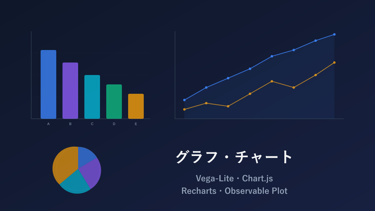
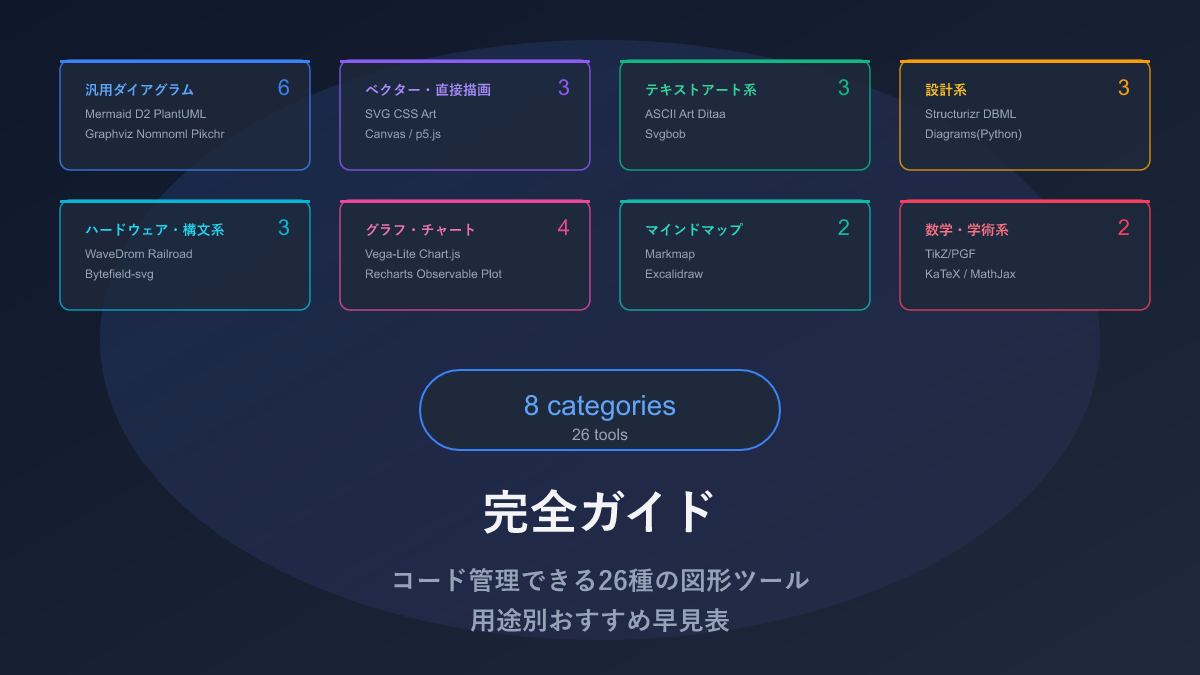
Thank you for visiting this site. This article is the sixth installment in the series on code-manageable diagrams for the AI era, covering 4 chart and graph tools. For the full series index, see the Complete Guide.
Revenue trend line charts, tool comparison bar charts, dashboard radar charts — these too can be defined as text (code) and managed in Git. This article introduces 4 tools where you can ask AI to “turn this data into a chart” and get back runnable code.
The scope for this approach to shine only grows in the AI era. Hand your CSV or spreadsheet data to an AI and ask it to “generate a chart that shows the trend” — it will select the appropriate chart type and generate the code. The work of opening Excel every time a chart was needed for a report now completes with a single sentence to AI. And because it is code, updated data produces the latest chart using the same code.
Comparison Table
| Name | Syntax | AI Compatibility | Chart Types | Highlights |
|---|---|---|---|---|
| Vega-Lite | JSON | ◎ | Bar, line, scatter, heatmap, and many more | JSON-defined. Excellent AI compatibility |
| Chart.js | JavaScript | ◎ | Bar, line, pie, radar, scatter, and more | Widely used; abundant information available |
| Recharts | JSX (React) | ○ | Bar, line, pie, radar, area, and more | Integrates naturally into React apps |
| Observable Plot | JavaScript | ○ | Bar, line, scatter, density estimation, and more | High-quality output with minimal code. Designed by the D3.js creator |
Vega-Lite — Charts from JSON Alone
Vega-Lite is a tool where writing JSON that describes “the data and how to display it” auto-generates a chart. Rather than writing program logic, you define the chart like a configuration file. Developed by a research team at the University of Washington, it carries strong academic credibility.
For example, simply specifying “use the tool column for the x-axis, score column for the y-axis, and color by tool column” produces an appropriate bar chart automatically.
Sample: Bar Chart

{
  "$schema": "https://vega.github.io/schema/vega-lite/v5.json",
  "data": {
    "values": [
      {"tool": "Mermaid", "score": 95},
      {"tool": "D2", "score": 85},
      {"tool": "PlantUML", "score": 75},
      {"tool": "Graphviz", "score": 70}
    ]
  },
  "mark": "bar",
  "encoding": {
    "x": {"field": "tool", "type": "nominal", "sort": "-y"},
    "y": {"field": "score", "type": "quantitative"},
    "color": {"field": "tool", "type": "nominal"}
  }
}
Just specify data for the data, mark for the chart type (bar, line, etc.), and encoding for which column maps to which axis.
Sample: Layered Chart

{
  "$schema": "https://vega.github.io/schema/vega-lite/v5.json",
  "data": {
    "values": [
      {"month": "Jan", "revenue": 100, "cost": 80},
      {"month": "Feb", "revenue": 120, "cost": 85},
      {"month": "Mar", "revenue": 150, "cost": 90}
    ]
  },
  "layer": [
    {
      "mark": "bar",
      "encoding": {
        "x": {"field": "month"},
        "y": {"field": "revenue", "type": "quantitative"}
      }
    },
    {
      "mark": {"type": "line", "color": "red"},
      "encoding": {
        "x": {"field": "month"},
        "y": {"field": "cost", "type": "quantitative"}
      }
    }
  ]
}
Pros and Cons
Charts complete with JSON alone, no program logic required — that is its greatest strength. Specifying the data type (categorical, numeric, etc.) sets axis tick marks and scales automatically, and Python users have Altair as an equivalent syntax option.
The trade-offs are a moderate amount of JSON to write and difficulty fine-tuning visual appearance. It is a bit much for just “quickly producing a chart,” and truly shines when reproducibility of analysis reports or data integrity matters most.
AI Compatibility
JSON format with clear structure is very easy for AI to generate. Just pass data and say “make this into a bar chart with Vega-Lite” and everything from $schema to encoding settings comes out. In fact, multiple AI tools — including Claude Artifacts — use Vega-Lite internally, and it is becoming increasingly prominent as the data visualization format for the AI era.
Chart.js — The Most Widely Used Chart Tool
Chart.js is the most widely used tool for displaying charts on web pages. It creates 8 types of basic charts easily: bar, line, pie, donut, radar, and more. You have likely encountered it in admin dashboards and web applications.
Sample: Bar Chart
const ctx = document.getElementById('barChart').getContext('2d');
new Chart(ctx, {
  type: 'bar',
  data: {
    labels: ['Mermaid', 'D2', 'PlantUML', 'Graphviz', 'SVG'],
    datasets: [{
      label: 'AI Compatibility Score',
      data: [95, 85, 75, 70, 60],
      backgroundColor: [
        '#4caf50', '#2196f3', '#ff9800', '#9c27b0', '#f44336'
      ]
    }]
  },
  options: {
    responsive: true,
    plugins: {
      title: { display: true, text: 'AI Compatibility Comparison of Diagram Tools' }
    }
  }
});
Sample: Radar Chart
new Chart(ctx, {
  type: 'radar',
  data: {
    labels: ['Chart Types', 'AI Compatibility', 'Tool Integration', 'Expressiveness', 'Layout Control'],
    datasets: [
      {
        label: 'Mermaid',
        data: [95, 95, 100, 70, 30],
        borderColor: '#4caf50',
        backgroundColor: 'rgba(76, 175, 80, 0.1)'
      },
      {
        label: 'D2',
        data: [85, 85, 50, 85, 60],
        borderColor: '#2196f3',
        backgroundColor: 'rgba(33, 150, 243, 0.1)'
      }
    ]
  }
});
Pros and Cons
High adoption rate means that when you hit a problem, a Stack Overflow search almost always finds a solution. The API is simple — just pass a configuration object to new Chart(ctx, {...}). Animations and tooltips come built in, producing good-looking charts with minimal code.
Images degrade slightly when zoomed (Canvas-based) — which is a matter of taste — and for print purposes or Retina displays, Recharts or Observable Plot may be preferable. Performance can also degrade when data points exceed several thousand.
AI Compatibility
High adoption means AI training data contains abundant Chart.js code. Pass data and say “make this into a line chart” and everything from the new Chart(ctx, {...}) initialization to option configuration comes back. My impression is that Chart.js produces the most reliably functioning AI-generated output among chart tools.
Recharts — Dedicated Chart Tool for React Apps
Recharts is a dedicated tool for adding charts to React-built web applications. If you are not using React it is irrelevant, but if you are building a React app, it is the most natural option for adding charts. It renders using SVG, so images stay crisp at any zoom level.
Sample: Bar Chart
import { BarChart, Bar, XAxis, YAxis, Tooltip, CartesianGrid } from 'recharts';

const data = [
  { name: 'Mermaid', score: 95 },
  { name: 'D2', score: 85 },
  { name: 'PlantUML', score: 75 },
  { name: 'Graphviz', score: 70 },
];

function AIScoreChart() {
  return (
    <BarChart width={500} height={300} data={data}>
      <CartesianGrid strokeDasharray="3 3" />
      <XAxis dataKey="name" />
      <YAxis />
      <Tooltip />
      <Bar dataKey="score" fill="#4caf50" />
    </BarChart>
  );
}
Sample: Composed Chart
import { ComposedChart, Line, Area, XAxis, YAxis, Tooltip } from 'recharts';

const data = [
  { month: 'Jan', users: 1200, revenue: 100 },
  { month: 'Feb', users: 1800, revenue: 120 },
  { month: 'Mar', users: 2400, revenue: 150 },
];

function Dashboard() {
  return (
    <ComposedChart width={600} height={300} data={data}>
      <XAxis dataKey="month" />
      <YAxis yAxisId="left" />
      <YAxis yAxisId="right" orientation="right" />
      <Tooltip />
      <Area yAxisId="left" dataKey="users" fill="#e3f2fd" stroke="#1976d2" />
      <Line yAxisId="right" dataKey="revenue" stroke="#f44336" />
    </ComposedChart>
  );
}
Pros and Cons
When developing in React, treating charts as React components is natural. Charts update automatically when data changes, and images never degrade when zoomed. A perfect choice for React app dashboards.
The flip side is that it simply cannot be used outside React. If you are using Vue.js, Svelte, or another framework, it is off the table. Also, performance can degrade when data points exceed several thousand, making Chart.js the better option for large datasets.
AI Compatibility
The JSX component structure is a pattern AI handles well, and the basic combination of <BarChart>, <XAxis>, and <Tooltip> is generated without issues. However, for complex configurations like multiple Y-axes with ComposedChart, the yAxisId linkage occasionally goes wrong.
Observable Plot — High-Quality Charts with Minimal Code
Observable Plot was created by the developer of D3.js — the data visualization titan — and is a tool for writing charts more concisely. D3.js often requires 100+ lines of code, but Observable Plot produces charts of equivalent quality in about 10 lines.
It works with React, Vue, and plain HTML — no specific framework required.
Sample: Bar Chart
import * as Plot from "@observablehq/plot";

const data = [
  { tool: "Mermaid", score: 95 },
  { tool: "D2", score: 85 },
  { tool: "PlantUML", score: 75 },
  { tool: "Graphviz", score: 70 },
];

const chart = Plot.plot({
  marks: [
    Plot.barY(data, { x: "tool", y: "score", fill: "tool" }),
    Plot.ruleY([0])
  ],
  x: { label: "Tool" },
  y: { label: "AI Compatibility Score" }
});

document.body.appendChild(chart);
A single Plot.barY() line completes the data-to-axis mapping.
Sample: Scatter Plot
Plot.plot({
  marks: [
    Plot.dot(data, {
      x: "complexity",
      y: "ai_score",
      fill: "category",
      r: "popularity",
      tip: true
    })
  ],
  color: { legend: true }
});
tip: true automatically adds a hover tooltip.
Pros and Cons
High-quality charts with minimal code is its appeal, with SVG output that never degrades on zoom. It works in any environment — React, Vue, or plain HTML.
Being a newer tool, information is not as abundant as Chart.js. When you want highly customized output, you may find it hard to locate examples.
AI Compatibility
Its simple syntax is easy for AI to generate. However, being newer than Chart.js or Vega-Lite means less training data — without explicitly saying “in Observable Plot,” code for other tools may come back. Specify it and basic charts using Plot.barY() or Plot.dot() generate without issues.
Practical Tips: Instant Chart Preview in AI Chat
Using Claude (Artifacts feature) or ChatGPT (Canvas feature), you can preview AI-generated chart code on the spot. For example, ask Claude to “turn this CSV data into a line chart” and Vega-Lite or Chart.js code is generated with the chart visible in the same screen — then refine it interactively with “change the colors” or “move the legend to the bottom.”
This way, you can prototype charts without installing anything locally, then just copy the finished code into your project. Vega-Lite’s JSON format in particular is well-suited to copy-and-paste — completing the JSON definition in AI chat and embedding it directly in your app is an efficient workflow.
Selection Guide
| Your situation | Recommendation |
|---|---|
| Want AI to generate charts | Vega-Lite |
| Charts for data analysis reports | Vega-Lite |
| Web app dashboards | Chart.js |
| Not sure where to start | Chart.js |
| Adding charts to a React app | Recharts |
| High-quality charts with minimal code | Observable Plot |
| Need charts that stay crisp when zoomed | Recharts or Observable Plot |
| Want to use from Python | Vega-Lite (via Altair) |
Installation
Vega-Lite
npm install vega-lite vega vega-embed
# Python: pip install altair
Chart.js
npm install chart.js
# CDN: <script src="https://cdn.jsdelivr.net/npm/chart.js"></script>
Recharts
npm install rechartsObservable Plot
npm install @observablehq/plotRelated Articles
Summary
This article compared 4 chart and graph tools as code-manageable visualizations for the AI era.
For adding charts to a web app, I recommend starting with Chart.js. High adoption means abundant information, and solutions are easy to find when you hit problems.
If you want AI to generate charts, Vega-Lite is the best fit; for React apps, Recharts integrates naturally; and for high-quality charts with minimal code, Observable Plot is worth considering.
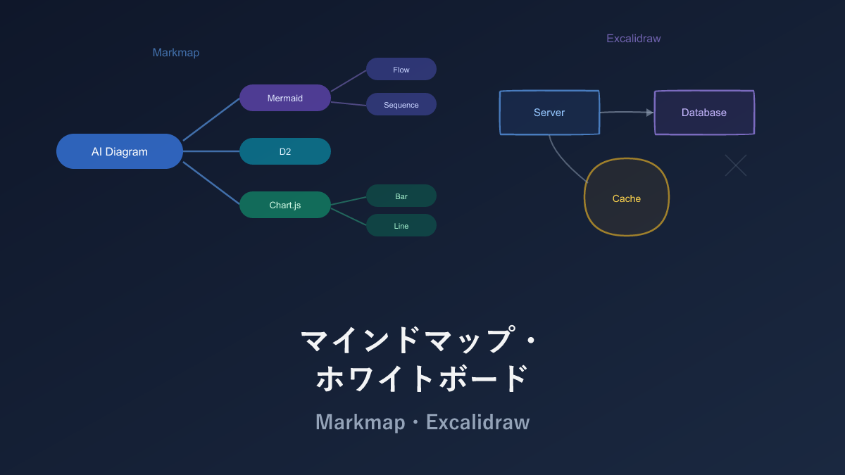
Next up: Mind Map and Whiteboard tools — Markmap and Excalidraw.
Series Index → Complete Guide to Diagrams in the AI Era
For further details, see the official sites: Vega-Lite / Chart.js / Recharts / Observable Plot
Thank you for reading. We hope to see you in the next article.